Digital products
Company— Drop Mobility
Project role— Lead Designer
Responsibilities— Research, design, marketing, branding, illustrator
Overview
I was the first designer to join the team at the time when bike-share was at the height of media attention. Lime, JUMP, Skip, Spin and more were entering markets aggressively with minimal concern about city infrastructures and China’s bike graveyards were becoming the central image of micro-mobility.
Service model
Even though micro-mobility primarily serves riders, it also impacts non-riders. Collaborating with cities, we created a system that caters to all residents and seamlessly integrates with pre-existing services in the city's infrastructure. By aligning cyclists' habits with our service—such as parking and locking—we ensured vehicles didn't disrupt city functionality.
3 intergral parts:
A white labeled app customizable based on the city’s needs.
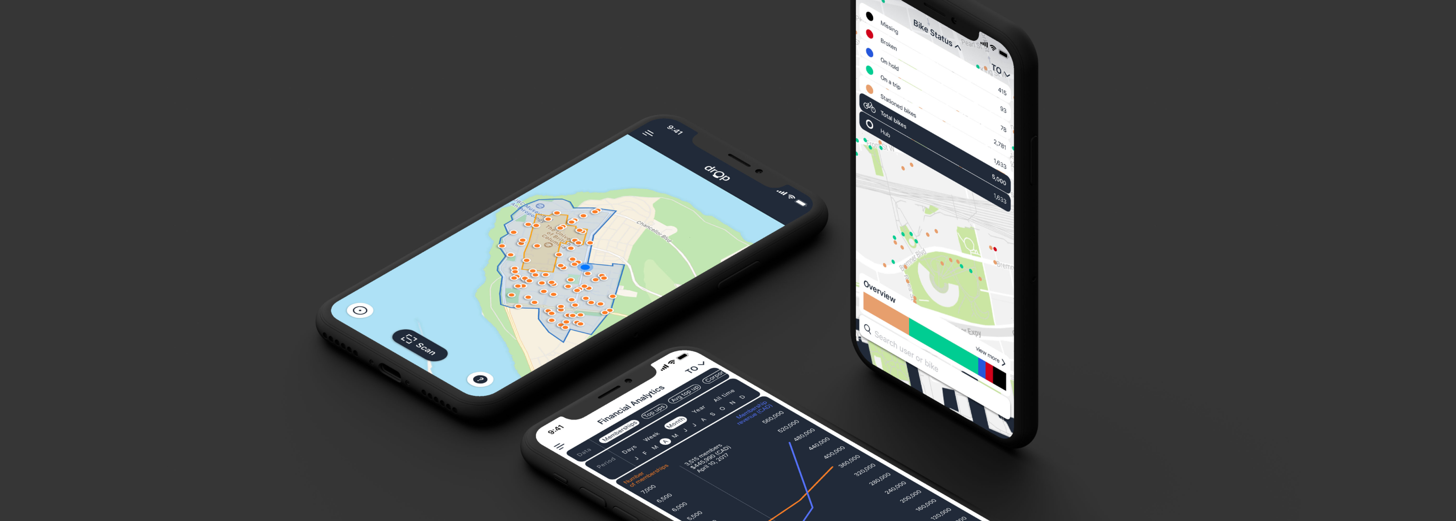
An admin access to provide an overview of the system to city partners and Drop to help make data based decisions.
A bike warrior access to help bike warriors track, rebalance and fix vehicles that have been marked for repair.
①
Whitelabled app for custom solutions
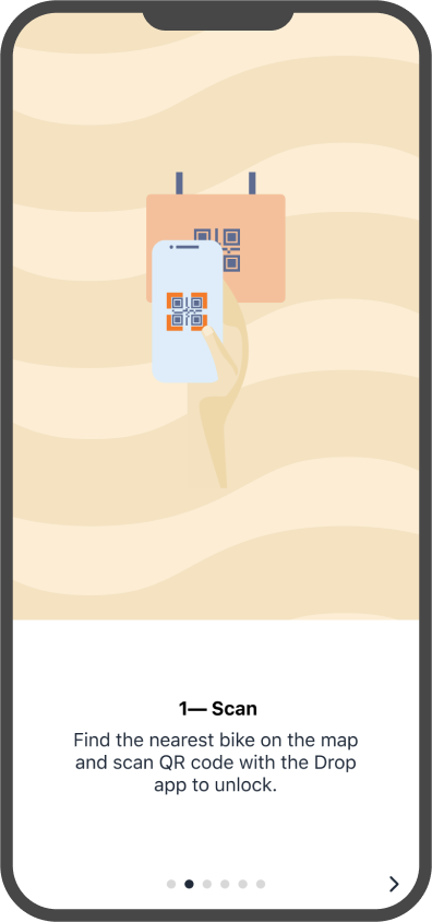
At it’s core, the app allows riders to scan to unlock the vehicle, track their journey, park, and submit a photo as record of their usage. The app can be further customized to incoporate a city’s branding, parking infrastucture, language, and type of vehicles friendly for the geography to make the operation truly function for a city’s needs.
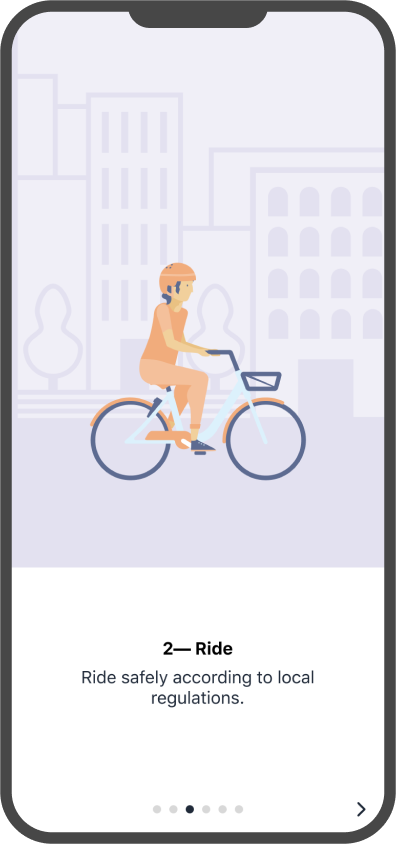
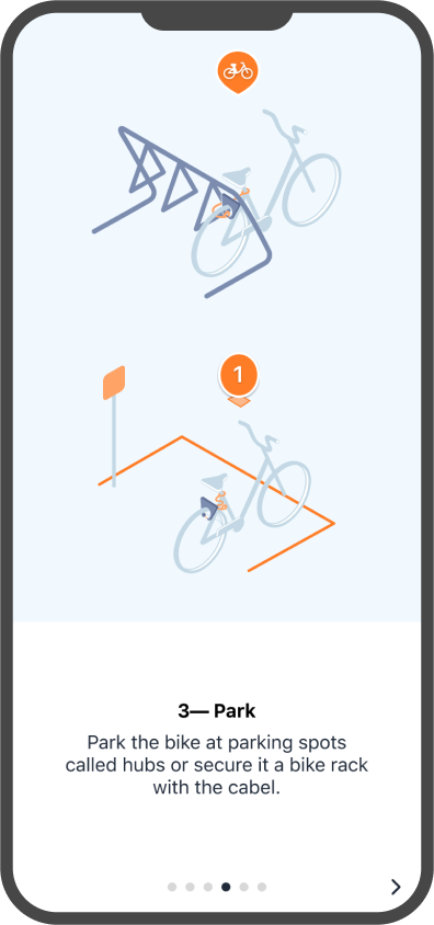
Onboarding
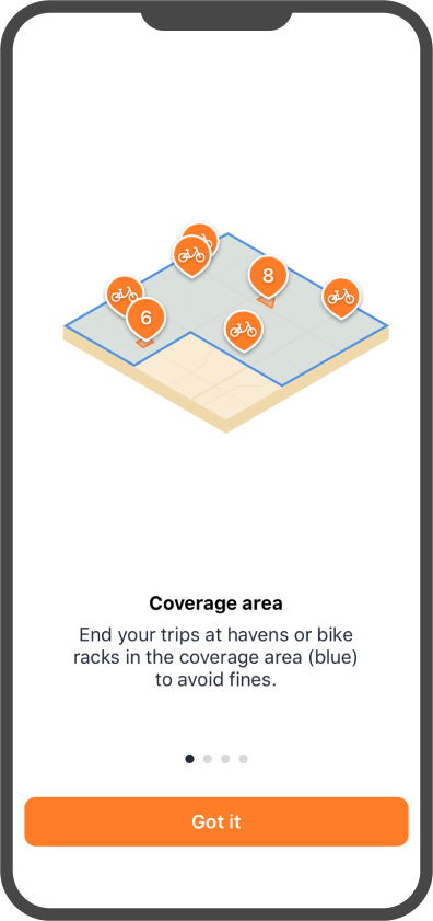
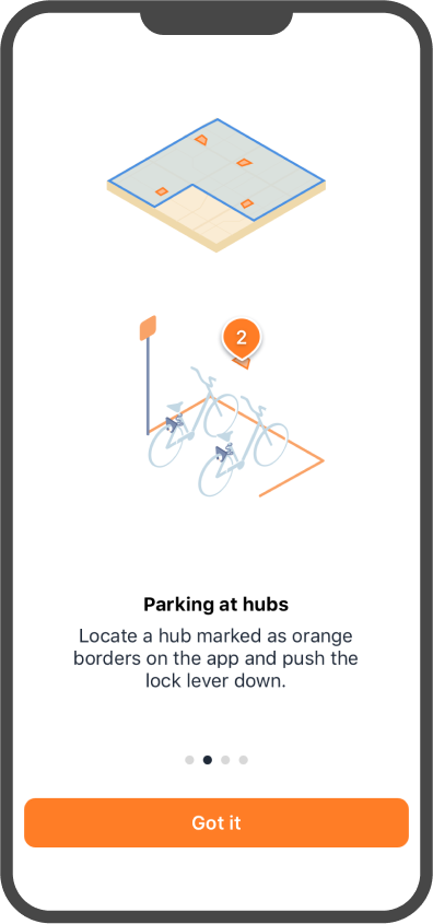
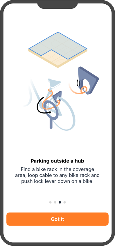
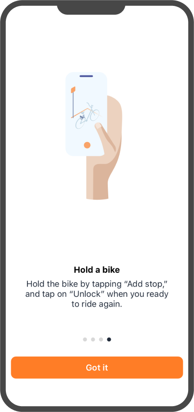
The app depends heavily on iconography and illustrations to communicate concepts that may otherwise sound confusing.
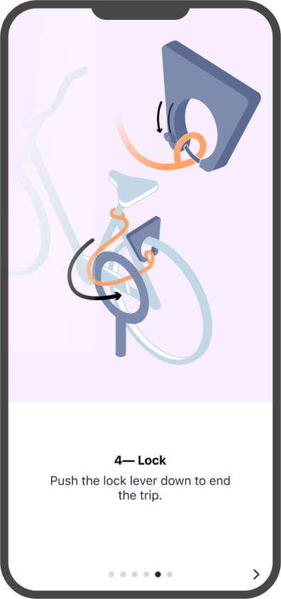
App Overview
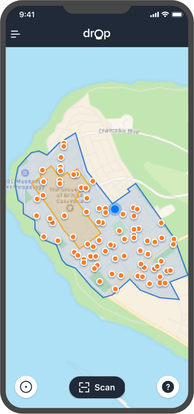
1. Home screen: zoomed out map with coverage area, pedestrian priority zone and bike locations
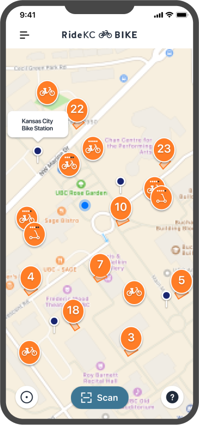
2. Custom brand: RideKC
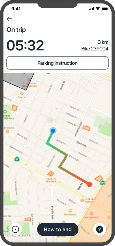
3. On trip screen: track trip, and view exclusion zones, pedestrian priority zones, parking hubs and parking instructions
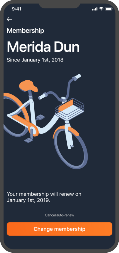
4. Membership screen: view and manage membership
Parking instructions
Instructions are shown when the user taps on Parking instructions while the user is on a trip. The illustrations shown would be based on local infrastructure to create a clear distinction between where the rider can park.
②
Admin access
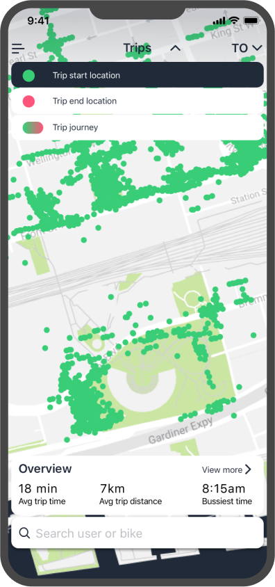
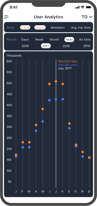
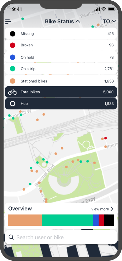
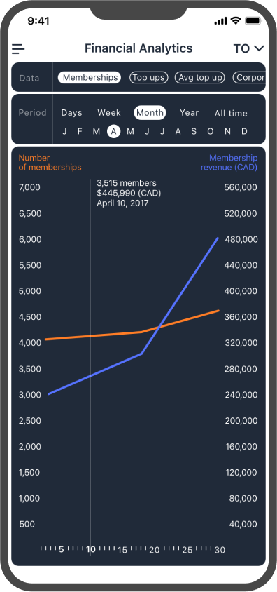
Admin access provides city partners and ourselves with helpful insights into how people move to initiate meaningful iterations to the system and create more delightful experiences for users.
The in-app and web admin access both use data visualization to communicate information and give quick overviews to make the decision-making process more intuitive.
③
Website
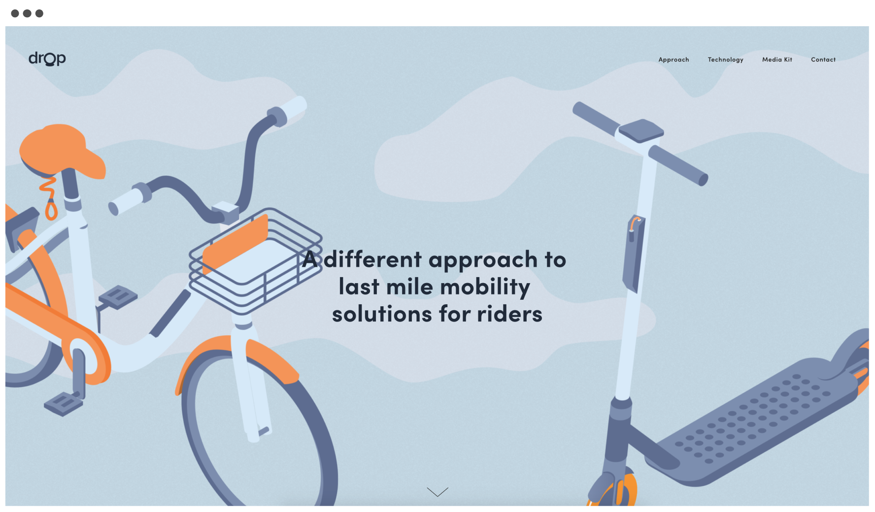
The website provides an overview of the company approach and how we achieve it for potential stakeholders. Dropmobility.com
:)
:)
Social media
©2021